 Learn the best color theory photography tips for mixing and displaying colors, in visually appealing combinations, known as color harmonies.
Master camera techniques for shooting, and photo editing tips in Lightroom & Photoshop, while creating perfect color harmonies, with the following written and video color theory photography guide.
Table of Contents
Video: Color Theory Photography Guide
Understanding Color & Light
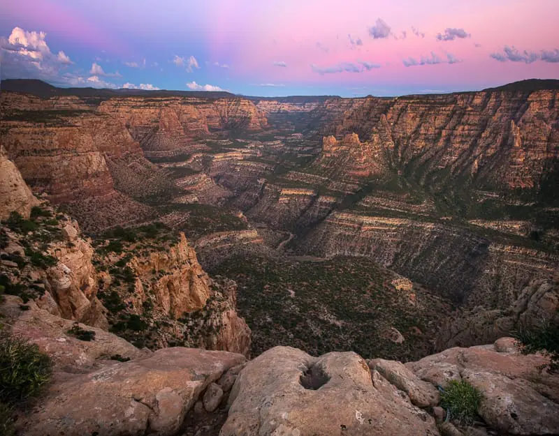
Light is the single basic ingredient required to create photographs. Without light, pictures don’t exist.
Digital photography is the process of transferring light energy, carried by photons, into digital information, which can be processed and displayed by computers and cameras in the form of digital images.
Light also contains the ability to produce color. Color is produced by specific energies or frequencies of light, known as visible light.
Understanding color theory and creating beautiful images requires a basic knowledge of color & light.
This basic understanding is essential for mastering all other aspects of photography, including shooting & photo editing.
Creating Color – Light Waves & Frequency
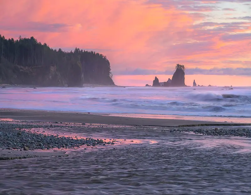
Light waves carry energy, determined by frequency, carried by small packets known as photons. This energy provides the basis for human vision, solar power and digital photography.
The human eye can see light that exhibits a certain range of energy. Energy contained in light photons interacts with the retina ( rods & cones ), releasing energy as electrons, creating electrical impulses, communicating with our brain to produce vision. Specific colors correspond to specific frequencies of light as shown in the graphic below.
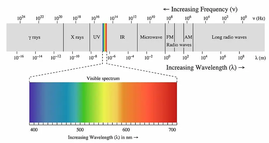 |
| Graphic Attribution – Philip Ronan |
When light waves & photons interact with silicon image sensors free electrons are released from the collision.
The number of electrons released depends on the photon energy. The photon energy depends on the light frequency.
Pixels are small buckets for collecting & counting electrons. They are the basic building block of image sensors found in digital cameras.
Understanding Light Frequency
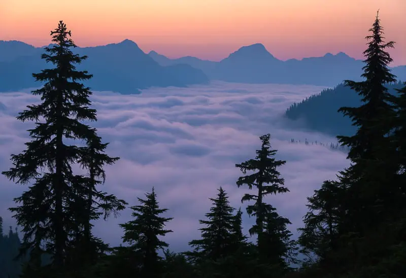
Compare light & light waves to ocean water hitting the beach as waves throughout the day.
Although the ocean is a single object, each of its waves carries different amounts of energy, acting as a separate entity.
Storm waves coming in very quickly, hitting the beach one after another, every second, contain a large amount of energy, often destroying buildings or boats.
Calm weather waves may only hit the beach every minute. The energy contained in calm weather waves is much less, allowing visitors to lay on the beach in the sun.
The energy carried by these waves can be defined by the frequency or number of waves coming in one after another.
The horizontal distance from the top of one wave to the top of the following wave is defined as 1 wavelength.
Waves coming in during a storm, very quickly, have a high frequency. High-frequency waves have small wavelengths with less distance from one wave top to the next.
During calm weather waves have a low frequency. Low-frequency waves have large wavelengths as the distance from the top of one wave to the next is much larger.
The characteristics of wavelength and frequency determine the energy carried by water and by light waves.
Photons – The Building Blocks of Light
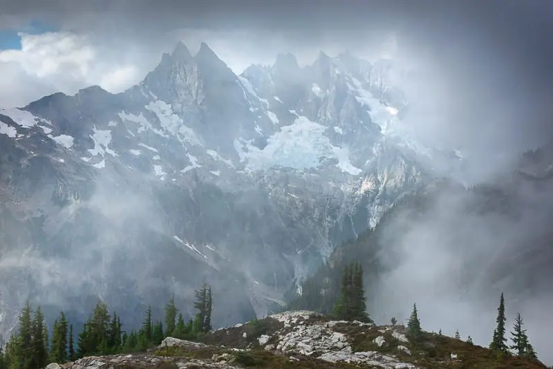
Photons are the basic building blocks ( particles ) of light waves, which carry energy, determined by wave frequency. The number of photons is proportional to the amount of energy & light.
More Light = More Photons = More Energy
Less Light = Less Photons = Less Energy
Photons make up light waves yet have the ability to interact with their surroundings as singular particles.
Photons are waves and particles at the same time, thus photons maintain a “wave nature”. This wave-particle nature or Wave-Particle Duality as taught in particle physics and quantum mechanics.
Light does not contain color and neither do photons.
Light & photons carry energy determined by frequency. When this energy interacts with another object, evolved or designed to “see” visible light, such as the human eye or an image sensor, color is perceived.
Different colors are the resultant of different light energy levels, determined by the the light wave’s frequency, using the following simple equation:
E = h*f
E is the photon energy, h, is Planck’s Constant & f is the lightwave’s frequency.
Increased Frequency = Decreased Wavelength = Higher Photon Energy
Decreased Frequency = Increased Wavelength = Lower Photon Energy
Pixels – Buckets for Collecting Light

As light / photons collide with the image sensor free electrons are released from the sensor’s surface.
Imagine a missile ( photons ) hitting a brick wall ( sensor ), pieces of brick ( electrons ) will fly everywhere.
Each free electron carries a small electronic charge.
Pixels, the smallest unit of the image sensor, are buckets for storing and counting electrons and their corresponding electronic charge.
This charge, collected by each pixel, produces a digital signal which communications the pixel color into digital space, using binary code (zeros & ones).
This massive amount of information is all carried by light, at the speed of 299,792,458 meters per second or 983,546,666 feet per second.
This entire section can be summed up by the following two equations:
More Light = More Photons = More Electrons = Larger Signal = More Photo Information
Less Light = Less Photons = Less Electrons = Smaller Signal = Less Photo Information
The Language of Color & Light
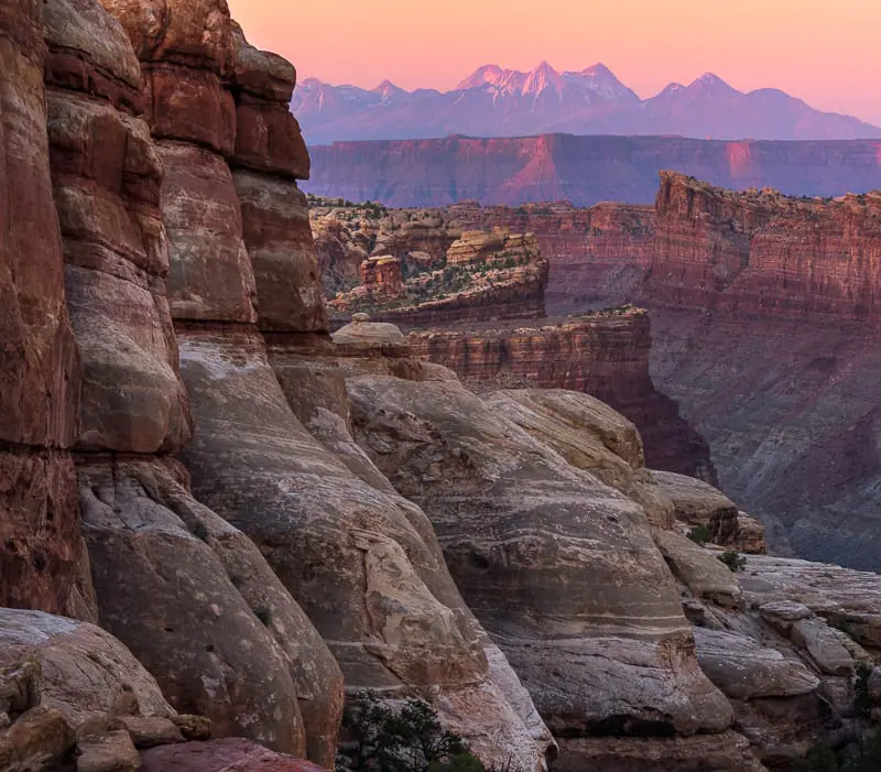
Prior to learning color theory, which contains the best practices for mixing, editing and displaying color in photographs, a basic understanding of the technical language is required.
This language is also used by camera software, and image editing programs such as Lightroom, Camera RAW, Capture One, and Photoshop.
RGB Color Wheel
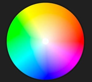 The RGB Color Model, most often used in photography, is a language of color.
A color model is a system used to define & communicate color. RGB simply defines the primary colors for this model which are Red, Green, and Blue.
Color gamut is the entire range of possible colors which can be produced by mixing the three primary colors.
Combining primary colors, which lie adjacent to each other on the color wheel, produces secondary colors.
Red and blue produce magenta, blue and green produce cyan, green and red produce yellow. There is a nearly infinite number of different color combinations.
Photo editing programs such as Lightroom, Photoshop & Camera RAW use 3 basic technical terms to describe color & light, they are as follows:
Luminance – The Absolute Measurement of Light
Luminance measures the absolute intensity of light, that hits the eye, after reflecting off an object.
Luminance is measured in candela per square meter, written as cd/m^2.
Luminance is a measured value such as velocity or weight. It does not depend on the human eye or setting, only measured physical attributes.
Brightness – Our Perception of Luminance
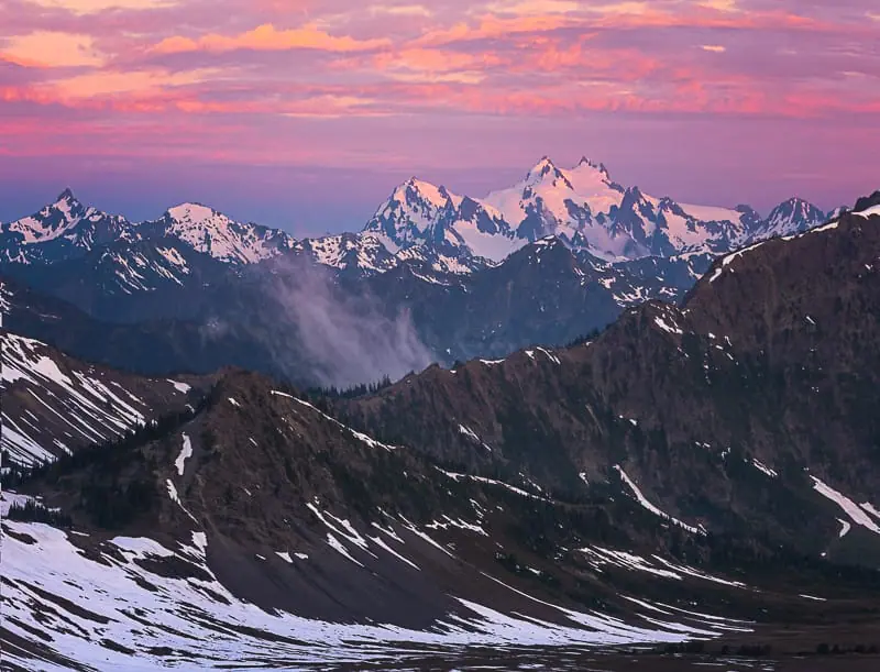
Brightness is used to denote how the human eye perceives the luminance of an object.
For example, a computer screen at maximum luminance looks brighter in a dark room than it would outside in the sun.
Although the luminance of the computer screen is the same our eyes perceive it’s brightness differently, depending on the conditions for viewing.
Brightness can range from dim, at the low end, to brilliant at the high end. Brightness is perceived value. It is not measured. It changes dependent of surroundings.
Lightness (Luminosity) – Our Perception of Brightness, Compared to White
Lightness, also known as luminosity, is the perceived brightness of an object when compared to another 100% white object, both illuminated by the same light source.
Lightness is the perception of brightness, without color information, on a scale from black to white.
The lightness or luminosity scale, ranging from black to white, is known as the tonal range or tonal scale.
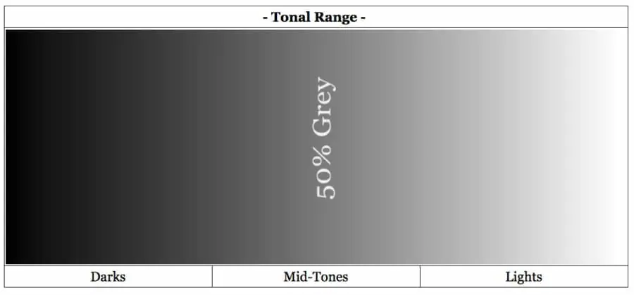
Pure black is found on the far left and has a lightness of 0%. Pure white is found on the far right and has a lightness of 100%.
In the direct center of the tonal range lies 50% gray, which is a mixture of ½ black and ½ white. 50% gray also known as middle gray, has a lightness of 50%.
Many make the mistake and call this 18% gray. 50% gray has an 18% reflectance in visible light. It is not 18% gray.
Image histograms depend on luminosity, to display lightness information, for each pixel contained on the image sensor.
Understanding Luminosity – Brightness vs. Lightness
The following colors of yellow and blue have the same brightness, as viewed on the screen, but our eyes perceive this brightness differently.

- Compared to blue, our eyes perceive the brightness of yellow to be closer to white.
- Compared to yellow, our eyes perceive the brightness of blue to be closer to black.
Yellow has a higher perceived brightness value, known as lightness, when compared to blue.
On the tonal scale, blue’s lightness is provided on the left and yellow’s lightness is provided on the right.

Just remember, lightness is the perception of brightness, without color information, on a scale from black to white.
In this last example, we look at 5 different fully saturated colors at 100% brightness, along with tonal values of how the human eye perceives their brightness, also known as lightness or luminosity.
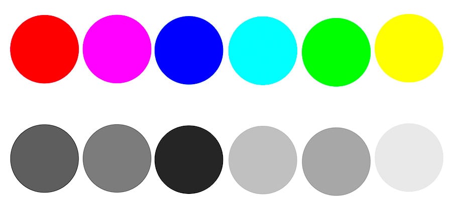
The brightness of pure green and pure magenta are exactly the same in the color example above.
Our eyes perceive their brightness to be slightly different as seen in the tonal values provided below each color.
The perceived brightness, known as lightness, of green is greater than that of magenta.
These techniques are the basis for color contrast & color theory as taught in the following section.
Luminosity (Lightness) is one of the most important concepts in photography!
Now we will learn to control color using Hue, Saturation & Brightness.
What is Hue?
- A hue is a color without any black, white or gray added to it.
- A hue is known as a pure color.
Hues are shown in the graphic below. Usually, hues are labeled by degrees corresponding to their location on the color wheel circumference.
All hues are colors, not all colors are hues. To produce different colors, hues are tinted, shaded and toned.

Accreditation Wikipedia / Kalan
What is Tint, Shade & Tone?
Adding white to a color is known as Tinting.
Adding white to a hue, such as green, which lies at 120 degrees, produces different tints of green, ranging from pure green hue to almost white color.
As colors are tinted their lightness ( luminosity ) value increases, on the scale of black to white, known as the tonal scale.
A luminosity histogram, as found in cameras and photo editing software provides lightness values for each pixel. As colors are tinted, the histogram shifts to the right, towards white.
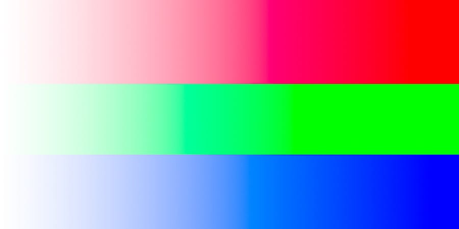
The three primary colors in the RGB Color model are shown below. Pure hues are found on the right.
As white is added, the hues become tinted, and the lightness increases. Any color that’s not pure white can be tinted.
Adding black to a color known as shading.
Shading decreases the lightness value of colors, decreasing their perceived brightness on the tonal scale. When a color is shaded, the histogram shifts to the left, towards black.
Hues are found on the far right, as black is added they become shaded and appear darker.
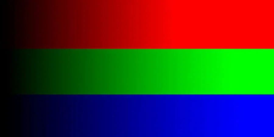
Adding gray to a color is known as toning.
The graphic below shows the addition of 50% gray ( half black / half white ) to red, green and blue.
Toning doesn’t always have to consist of 50% gray, but can include all tonal values of gray.

What is Saturation in Photography?
- Saturation is the purity of a color.
- Fully saturated colors are hues or pure colors.
- Non-saturated colors, known as tones, lie on the black to white tonal scale.
The more saturation a color has, the more vivid it looks to the human eye. The less saturation a color has the more washed out or faded it looks.
- Adding white to any color, known as tinting, desaturates it.
- Since toning adds white & black to a color it also desaturates the color.
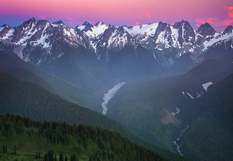
Adding pure black, known as shading, does not desaturate a color, yet lowers it’s lightness value, or perceived brightness, shifting the histogram to the left.
In the graphic below, fully saturated hues, magenta, cyan and yellow are found on the far right. As the colors are tinted, and white is added, the saturation lowers.
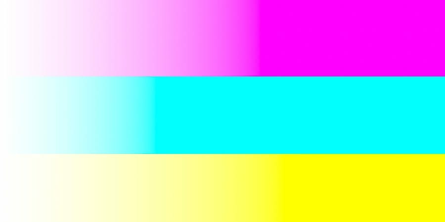
As a color becomes more tinted and desaturated, the luminosity or lightness of the color increases, as the perceived brightness becomes closer to pure white. This shifts the histogram to the right.
Photo Editing with The Color Wheel
We use cameras, computers, and software to capture and manipulate digital images.
Therefore we need a way to communicate specific color properties with these electronic devices. Color Coordinate Systems allow us to do this.
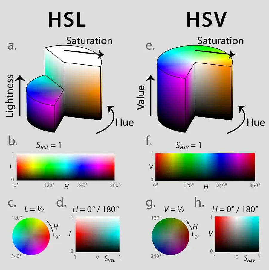
The HSL Scale (Hue, Saturation, Lightness) is a cylindrical coordinate system used to represent all colors in the RGB Color Model.
The HSV Scale (Hue, Saturation, Value ) is also a cylindrical coordinate system used to represent all colors in the RGB Color Model.
Sometimes HSV is referred to as HSB or Hue, Saturation, Brightness. They are one in the same. Brightness and Value, represent the same thing.
 |
| Graphic Attribution: Jacob Rus |
Adobe Lightroom and Adobe Photoshop, as well as most other photo editing programs, use a combination of HSL and HSB Scales for the representation and adjustments of color and light.
Becoming proficient in digital photography requires the mastery of digital editing software, just as film required mastery of the darkroom.
Digital editing software is used to post process RAW files as film negatives were post-processed in the dark room.
Take a few minutes to look at the graphic comparing the HSL & HSV Scales.
Opening Photoshop and following along from here on out will ensure a firm understanding of this topic.
HSL vs. HSV in Photoshop
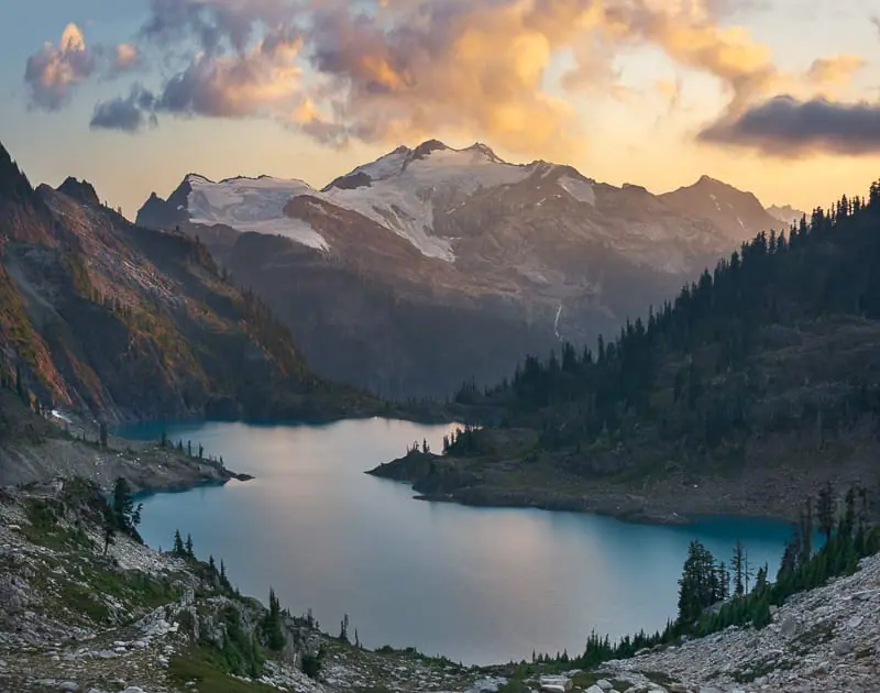
In both HSL and HSV color coordinate systems hue and saturation denote the same characteristics. The only difference between the systems, Lightness & Value.
Views b. & f. in the graphic above show the Lightness and Value Scales. Each of these systems communicates exactly the same colors, but they do it in a slightly different language.
The HSV/HSB Coordinate System
HSV can also be represented as HSB or Brightness in some circumstances. Value and Brightness are the same. The Color Picker in Photoshop utilizes the HSV/HSB Coordinate System.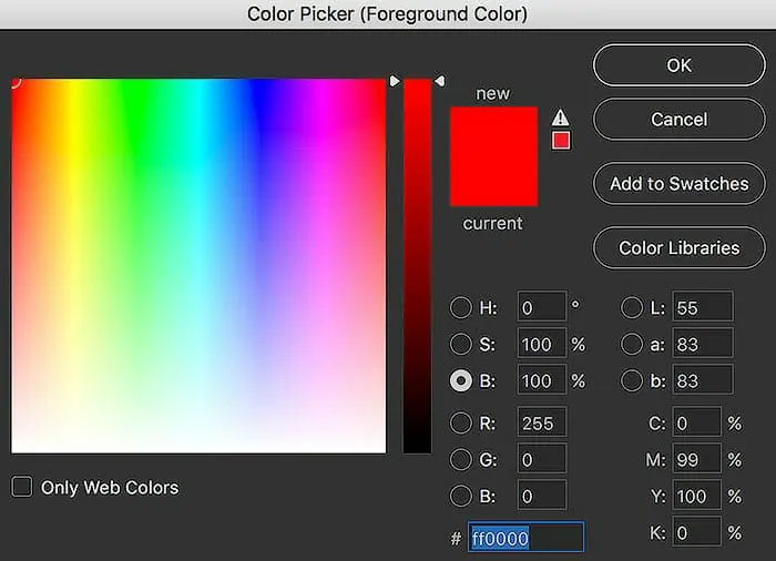 The B ( Brightness ) Scale, selected in the graphic above, ranges from 0% which represents pure black to 100% which represents full brightness for all colors.
These brightness values can be adjusted by dragging the slider up and down or typing in different values for B.
The Color Picker Box shows the Hue & Saturation Axis for the specified levels of brightness.
Different hues are selected by dragging the color picker left or right on the horizontal axis.
Different saturation values are obtained by dragging the color picker up and down on the vertical axis, ranging from pure color ( hue ) at the top or 100% saturation, to pure white at the bottom, or 0% saturation.
Dragging the slider down on vertical axis tints the color.

It’s also possible to show the other color picker axis adjustments by selecting the “S” or “H” circles in the color picker box.
I prefer to leave the Hue Selected for the slider, showing Saturation & Brightness in the color picker box.
As seen below ( right example ), At 100% brightness, the lightness for a fully saturated yellow hue is 99.
In comparison to pure white yellow has 99% the lightness value. To the human eye, this hue and saturation of yellow is perceived to be 99% as bright as pure white.
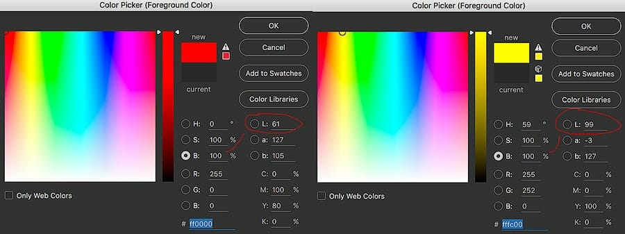
Let’s look at another pure color of 100% brightness and saturation. In this case, the color red has a Lightness of 61 at a brightness of 100.
Although both yellow and red can have the same brightness, pure red hue is only 61% as bright as pure white, whereas yellow is 99% as bright as pure white, as perceived by the human eye.
The HSL Coordinate System
The HSL Coordinate system ( in Photoshop ) uses lightness values scaled from Lightness = -100, which represents black, to Lightness = 100 which represents white. As previously discussed, lightness works on the tonal scale from black to white.
TECHNICAL NOTE: Some programs or graphics call the lightness of black, 50% gray, and white, 0, 1/2 and 1, respectively. Since lightness is a scale, the number designation does not matter, only the understanding of the concept.
While the HSV system requires a change in saturation value to obtain pure white, the HSL system does not.
This is the main difference in the two systems. The HSV System is on the brightness scale, while the HSL System is on the lightness ( perceived brightness ) scale.
Since hues are colors without any tint ( white ) or shade ( black ), they can only exist at Lightness = 0 for the HSL System, as seen in the Photoshop screen shot graphic. This graphic shows the HSL Adjustment within Photoshop.
The three sliders below allow the user to select any point in the HSL Coordinate System.
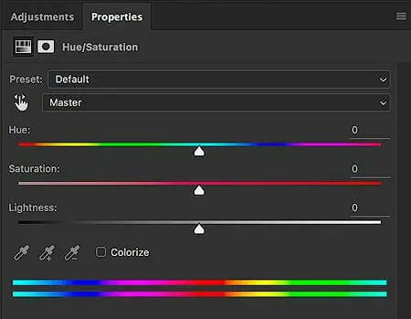
The saturation slider ranges from 50% gray at the far left to fully saturated color at the far right.
The lightness slider ranges from black at the far left to white at the far right. The hue adjustment is a standard 0-360 degrees.
Photoshop allows the selection of each color via a slider to reduce the number of sliders that need to be shown on the page whereas Lightroom shows each slider for each main color.
Key Points to Remember – HSL vs. HSV
The HSL Color System shows the entire range of any selected color from black to white.
The HSB Color System shows the entire range of color from black to full-color brightness. White can only be obtained in HSV by decreasing saturation to 0%. HSV Condenses the same information into a smaller vertical axis.
These concepts will only start to make sense once you open Photoshop and start experimenting with the HSL Sliders & the color picker tool. This technique is shown in the video at the top.
Now that you understand the nature of color and light, and it’s communication into the digital world, it’s time to learn about color theory and color harmony.
Understanding Color Harmony
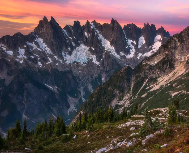
Color Theory provides the best practice methods for displaying & combining colors in ways that evoke certain feelings, moods or emotions. Science and psychology show that certain color combinations attract viewers while others repel them.
The human eye favors visually appealing color combinations known as color harmonies.
Photographers and artists can utilize this knowledge to create appealing works of art which communicate clearly with their audience.
What is Color Harmony?
A color harmony is the display of two or more different colors, in close proximity, that complement each other and look appealing to the human eye.
Combining the incorrect colors produces an undesired & confusing effect, similar to screaming kind words in an angry voice.
Combining the correct colors communicates the correct message from the photographer to the viewer, in complete harmony, without confusion.
- Nature provides the best examples of color harmony making these methods perfect for photographers & painters.
- Using a color wheel makes it much easier to select colors that provide harmony.

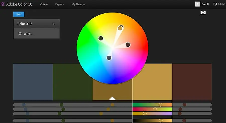
Shown below is a free color wheel provided by Adobe Kuler which also integrates with Photoshop as shown in the video above.
- The colors extending from yellow, orange, and red, to red magenta, are considered warm colors.
- The colors extending from magenta blue, blue, cyan, and green, to yellow-green, are considered cool colors.
The top graphic shows different arbitrary warm colors, while the bottom graphic shows different arbitrary cool colors.
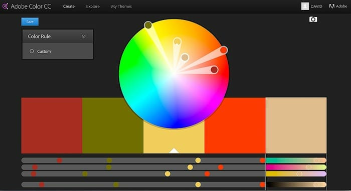
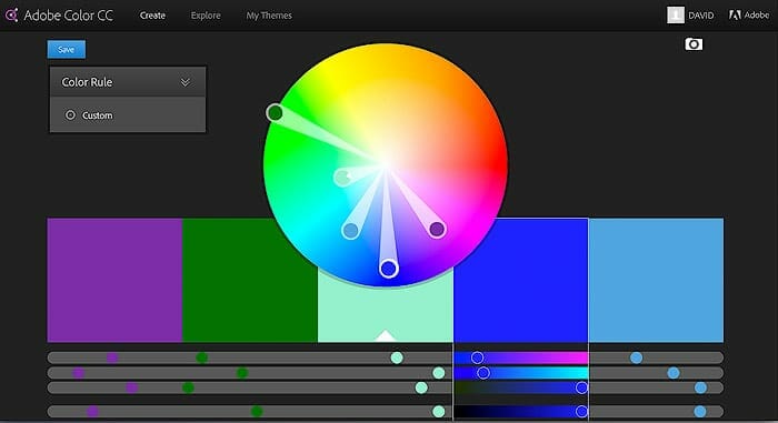
The color wheel shows a 2D view of the Saturation and Hue Axis, while the Brightness Axis is accessed using sliders on Adobes website.
- Full saturation and pure color ( hues ) are found around the circumference of the color wheel.
- Moving directly inward from each hue decreases saturation and adds white to the color, also known as tinting.
A Color transition moves your eyes through a photo by drawing them from warm to cool colors or other color harmonies. This is accomplished using color contrast.
Colors can also add mood or emotion to your photos. Red and orange provide feelings of energy or happiness, while certain colors of green and blue create calm or relaxed moods.
Types of Color Harmonies
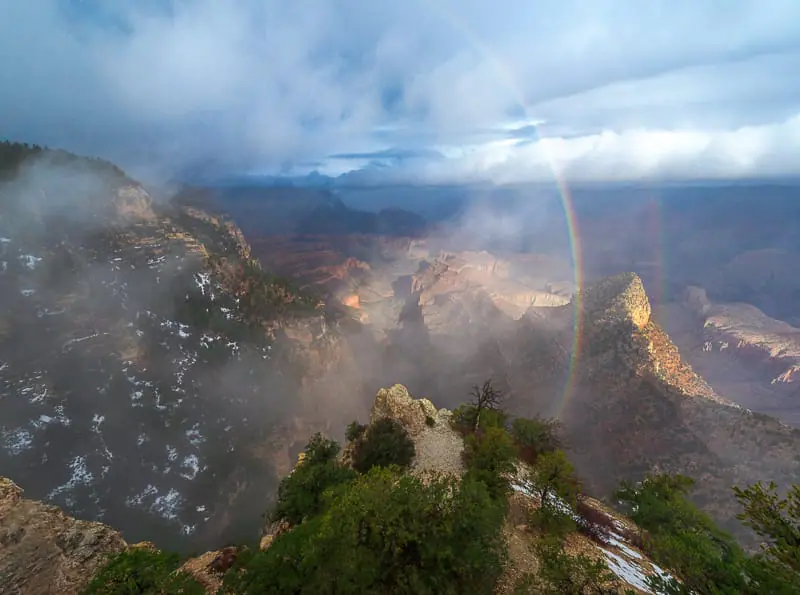
Although photographers don’t have as much control over color choices as do painters, they can still use color theory to their advantage.
There are 5 different types of color harmonies covered below which provide a nearly infinite number of color combinations. Other color harmonies exist, but a knowledge of the basics works perfectly.
Key Color is the main color which is selected for use in a work of art or photograph.
The key color is the single most important color in the image, without it everything else falls apart.
Most often the key color is the most dominant or frequent color in an image or work of art.
In the following examples, Albert Bierstadt’s paintings are used to display perfection in color theory. Bierstadt was known for his renditions of the American West during the mid to late 1800s. He is my favorite artist:)
View His Paintings at: albertbierstadt.org
Key Color
In the painting below, blue was used as the key color. The entire top of the painting includes different tints and shades of blue.
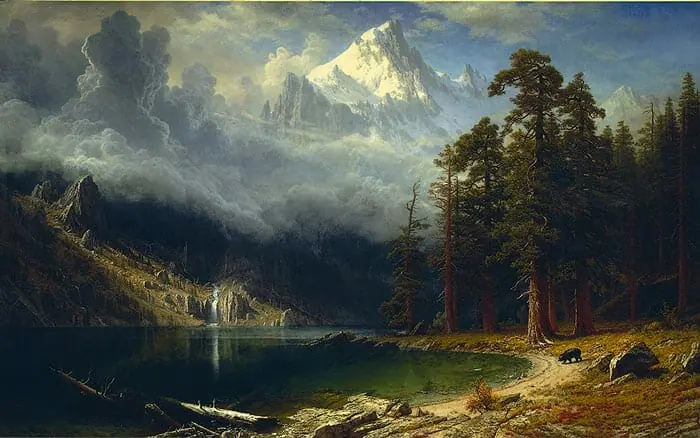
By downloading Bierstadt’s paintings each can be studied using the color picker in Photoshop or Adobe Kuler’s photo upload option.
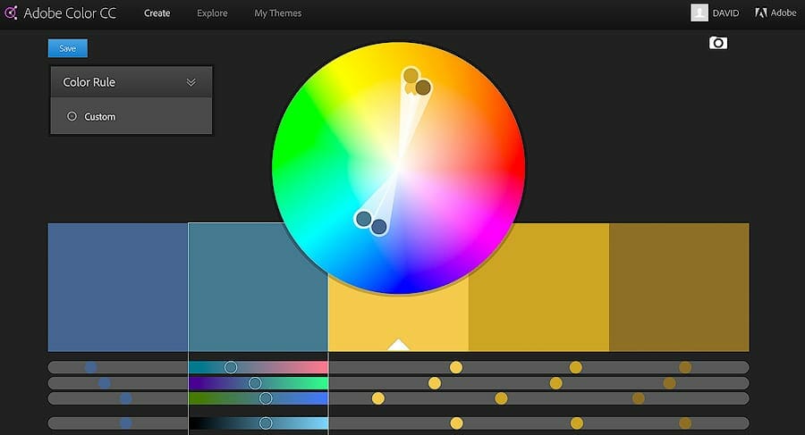
The following color pallet was created from the Key Color tones in the painting above.

Even the dark tones which appear almost black have a slight blue shade in them.
Dark shades in the shadows offsets the bright warm colors used to show vivid light hitting the righthand foreground and mountain peaks.
This is a color transition, which moves the eye through the painting, utilizing color contrast.

Color contrast is produced by colors of varying lightness or luminosity values. Blue has low lightness values whereas yellow has higher lightness values, producing contrast.
In nature, objects lit by sunlight produce warm colors while objects in shadows often produce cool colors.
Our mental idea of an object’s color in a landscape, such as grass being green, is often incorrect when taking lighting into consideration.
Grass under bright sunlight, although green without lighting, takes on a yellow-green color.
Grass in dark shade, although green in standard lighting, takes on a cool blue-green color. I’ve provided some examples of this in the next section.
This offset of warm and cool colors is a specific type of color harmony. There are many different types of color harmonies, providing the best practice methods for aesthetically pleasing color pallets in photography & art.
Direct / Complementary Color Harmony
A direct color harmony, also known as a complementary color harmony, includes the key color and another color which lies directly opposite on the color wheel.
Using direct color harmonies produces a high contrast between colors known as color contrast. Color contrast is produced when warm & cool colors are displayed side by side, of varying lightness values, high and low.
In the following image, the key color is blue and the complementary color is yellow. Different colors of blue and yellow are shown throughout the image, providing depth.
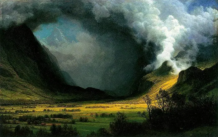
A dark shade ( black added to a color ) of green is present in the foreground but doesn’t draw much attention.
Photographers can remove attention from unwanted objects by burning or darkening them in post processing.
This causes the viewer to look at the brighter & more vivid colors first.
Analogous Color Harmony
Analogous colors lie directly next to each other on the color wheel. Different tints ( white added ), shades ( black added ), and tones ( gray added ) of orange are used in the painting below. The key color is clearly orange.
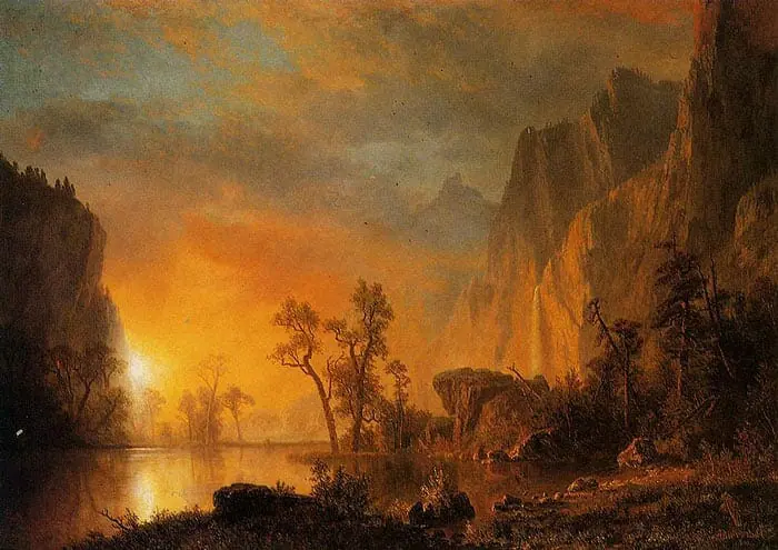
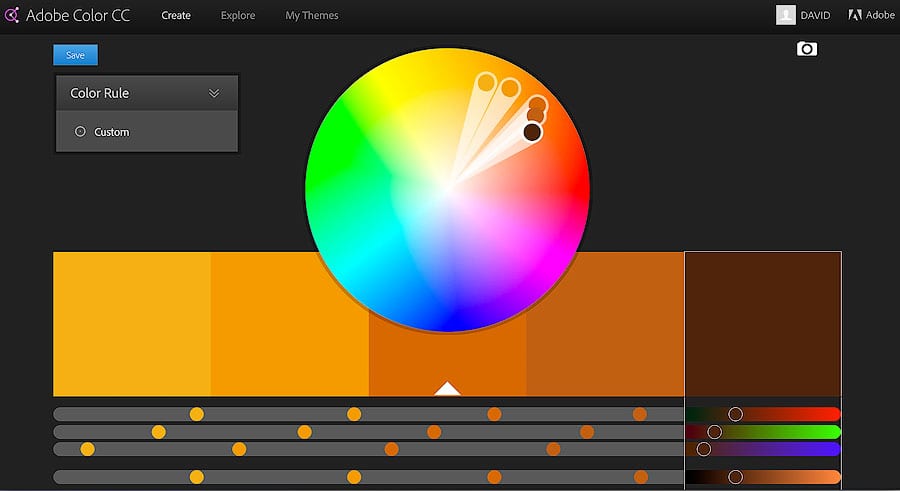
Analogous color harmonies are often found in nature and work very well for scenes with high tonal contrast. Without large areas of dark to offset the warm colors the painting below would be overwhelming.
Our eyes easily move around the painting due to the large numbers of different shades showing transitions from light to dark.
Triadic Color Harmony
The Triad or Triadic Color harmony uses 3 or more colors, spaced evenly, producing the points of a triangle.
Triadic color harmonies are often vibrant due to the spacing of the colors. Usually, the Key Color is dominant while the other colors are more subdued.
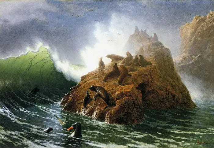
In the painting below, high contrast is used in the foreground with shades ( black added ) of orange and green, while low contrast is used in the background with tints ( white added ) of blue, green and orange.
Shading objects often makes them appear closer, and tinting objects often makes them appear further away.
Tinting the background colors provides the feeling of diffuse, dense, and humid air catching the sunlight.
A transition from dark to light adds a sense of depth to the entire scene. The cool colors of blue ( sky ) offset the warmer tints of orange ( rocks ), providing leading lines, moving your eyes from left to right through the painting.
On the right side of the large warm colored rocks a green shade is used to provide depth & detail to the shadows.
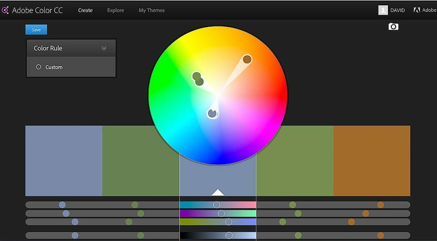
Split-Complementary Color Harmony
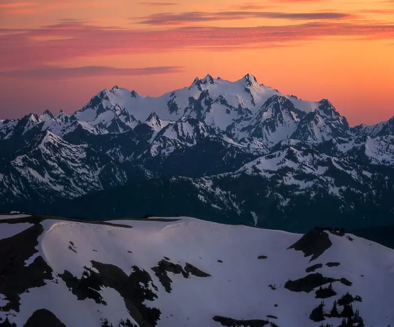
The split complementary color harmony is easy to use and often found in nature. Most sunsets and sunrises display this color harmony.
- After selecting the Key Color, find the complementary color that lies directly across from it.
- The split complementary colors are found on each side of the complementary color. They do not include the complementary color.
In the painting below blue is most likely the key color. It is found in the sky, waterfall, river, and shadows. Yellow and orange shades & tints are used as the split complementary colors.
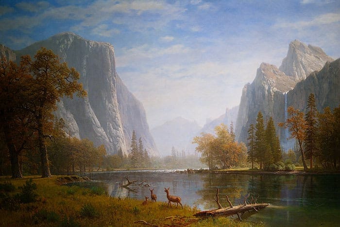
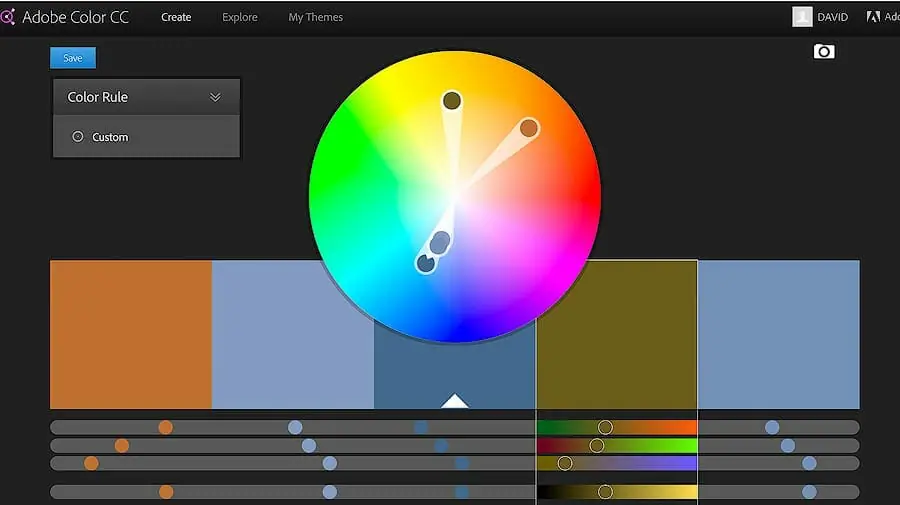
Dark reds are used in the foreground producing an autumn scene, while saturated yellow is used in for the center trees signifying a source of light.
Objects hit by direct sunlight often appear much more saturated than the same objects untouched by light.
Square Color Harmonies
By selecting a dominant key color and 3 subdued colors, spaced evenly around the color wheel, the square color harmony is formed.
This can change to a Rectangular Color Harmony by slightly moving each color. Test it out and see what works!
- The square color harmony is perfect for displaying the single most important object in a scene.
- All other subdued colors in the square are used to complement the key color and make the subject of the work stand.
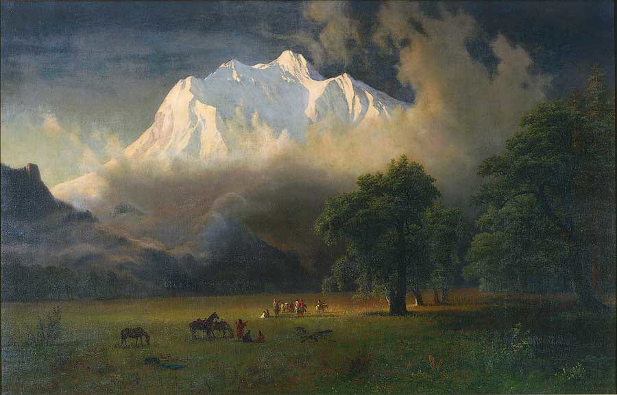
Below, light yellow or blue is most likely the key color. Either will work in this case.
Without blue the mountain is not dominant. Without yellow, the mountain also loses it’s power. Both colors provide a stark color contrast of low and high lightness values.
All other colors, such as dark green, dark blue and dark red complement and add more depth to the painting. The subject is clearly the peak, Mount Adams, which lies in the wilderness of my home state, Washington.
Landscape Photography Tips for Color Theory
Through school, kids books & massive amounts of brainwashing, we have a conception of color in nature which is usually incorrect.
We think that grass is green, the sky is blue, clouds are white, the sun is yellow, and water is blue.
In reality, these objects reflect different colors, depending on the weather, lighting, and seasons.
Studying color in nature, by spending time outside, is the only way to cure these misconceptions.
Looking at the color pallets used by Bierstadt you’ll notice that high saturation is rarely used and large dark areas make up most of the scene.
A few select colors are used with only one or two pulling dominant attention.
Nature is often displayed in the same way. Most objects that are seen on a daily basis, even under direct sunlight, exhibit tones darker than 50% gray.
Look around right now, wherever you are, most objects are probably in the darker tonal range.
- Pure white rarely exists in nature without a source of direct bright sunlight.
- Pure black rarely exists either, even in the night sky.
- Most of the natural world exists in the mid-tones, stretching from almost white to almost black, with a large portion near middle ( 50% ) gray.
Provided below are some camera techniques and photo editing tips that will help you to achieve beautiful color harmony for landscape & nature photography.
Blue & Turquoise
Blue is a cool color which can produce a great offset or complement to other warm colors found in nature such as orange or yellow.
When utilizing blue in images ensure that the saturation levels stays very low.
There are few situations where blue is displayed naturally with high saturation values. Look at the sky during the day, the saturation of blue is not extremely high, but the lightness value may be.
There are certain rivers, often produced by glacier melt, that display blue in a highly saturated manner. This also proves true for the late afternoon sky in high alpine areas.
All rivers are not blue & many oceans aren’t either. Most contain many different cool colors depending on the intensity of the water movement or flow, such as rapids, waves or smooth water. This can also change with lighting.
It works best to use varying low levels of saturation within the same hue. If blue is the most dominant or key color, then select a well-balanced color harmony to balance it.
Blues that are found in shadows will usually maintain lower saturation values than blues found in direct light.
The following example shows some colors of blue that are often found in nature. Even the most saturated of these blues, on the far left, is still very subtle.
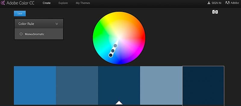
When blue starts to mix with green it produces Turquoise.
This color is not often found in nature. Alpine lakes, and some water sources display turquoise. When using this color ensure it’s very subtle.
Most likely turquoise will not be the key color but it can add a fantastic complement to the color harmony.
Red, Orange & Yellow
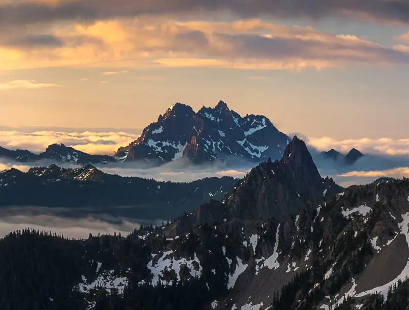
Red, orange & yellow evoke feelings of intensity and are often found in sunrises, sunsets, flowers and fall foliage. They are also found in many desert regions, especially the American South West.
Beware aware of the excessive use of these colors in your images for sunrise & sunset, along with other highly saturated colors, as they are extremely dominant.
If they key color is red, orange or yellow, it usually works well to offset them with dark shadow areas, of little or no color, balancing out the scene.
This technique keeps the eye from becoming overwhelmed and allows it to move through the image.
It’s very easy to overexpose red while capturing images. If the sky is red during sunset and the image is overexposed, the colors will tend to come out too orange or too yellow.
If necessary take two separate exposures, one darker image to capture the bright red in the sky, and another brighter image, to capture the foreground detail.
Watch the Red Channel on your camera’s RGB histogram, while capturing images, to ensure that red is not clipped off the right hand side. This will ensure easy post production of the RAW file with vivid true color.
Red is usually very saturated during sunrise or sunset, with low brightness levels, making it very vivid and colorful as seen in the example below.
Notice that these variations of red are very colorful and vivid, yet visually appealing to the eye.
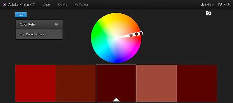
Yellow and orange are often found to be slightly brighter, with lower saturation levels.
Pure yellow is rarely found in nature. The lightness of yellow is much greater than the lightness of red, so it will appear to be lighter in images but less dominant.
Keep this in mind when adding or saturating yellow, red and orange.
Green
Green is often found in rivers, oceans, trees, and foliage. Although our eyes think of trees as green, this is often not the case.
- Under direct light, green tends to push towards yellow.
- Under low light green tends to push towards blue, especially in forest scenes.
Green can be a very hard color to edit in Lightroom & Photoshop, but here are a few tips.
Green in Direct Sunlight
If the green in your images looks overly saturated or too dominant slightly desaturate & darken the yellows.
This can be done with the HSL sliders in both Lightroom, Adobe Camera RAW & Photoshop.
Yellow makes green look over saturated and out of balance since they don’t produce a color harmony. This normally happens when shooting trees or forest scenes in direct sunlight.
Green is also a very easy color to overexpose. While capturing images watch the Green Channel on your camera’s RGB histogram to ensure no data is lost off the right-hand side, also known as clipping.
When green is clipped in the RAW file it produces an ugly neon yellow color that can’t be recovered in post processing.
The following example shows greens slightly shifted into the yellow hues, with low saturation and brightness levels. This keeps the greens looking natural, even under direct light.
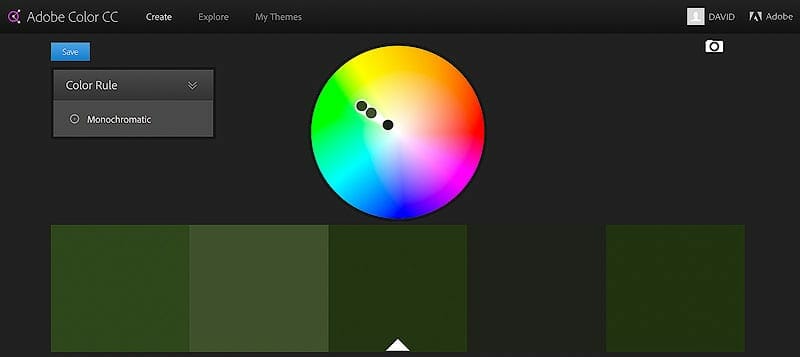
By lowering the brightness of the greens in your image they will tend to look more natural as shown in the following example.
Green Without Direct Light
Through millions of years of evolution, the human eye knows what natural green looks like. This is why your eyes may reject an overly bright or saturated green.
The following example shows greens that are shifted centrally into the green hue, ensuring that yellow or blue do not show up in the color.
These are the colors of green that will display in a lush forest without direct sunlight. Notice how dark these greens appear.
If greens in your image appear too yellow or too blue, use the HSL Sliders ( Lightroom, Camera RAW or Photoshop ) to shift the yellow or blue hues very slightly towards green, respectively.
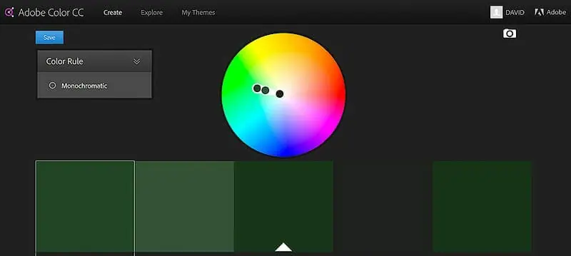
Use the color picker while editing your images to ensure your greens are kept at very low brightness.
Green in Shadows
When green is found in shadows it appears to have a slightly blue color. This rarely has a negative side effect, providing that the greens don’t push too far into blue.
Subtle shades of blue and green produce an analogous color harmony. As we discussed in the video, shadows often display very subtle shades of blue.
The graphic below shows greens that are shifted slightly into blue.
These colors of green would display very nicely in the shadow regions of a lush forest.
The slight blue shades in the shadows can complement any touches of yellow-green that are displayed on branches or leaves in direct light. 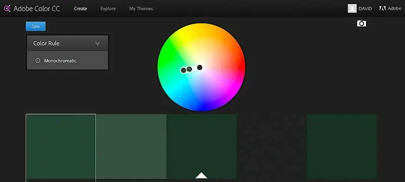
Magenta
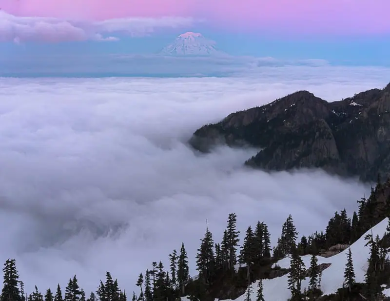
Magenta is rarely found to be very bright or saturated in nature. During sunrise, sunset, and twilight very subdued colors of magenta are found in the sky. A variety of different flowers also contain the color magenta.
Magenta is a very dominant color making it easy to overuse in an image. The overuse will easily take over the image and remove all color harmony.
The most vivid magenta colors are usually found during twilight hours.
- During photo editing adding too much blue to magenta makes it appears muddy and gray.
- Adding too much red to magenta makes it appear too purple or neon.
By keeping the brightness and saturation values low, as seen in the following image, magenta continues to look natural. Notice how the selection does not push into the red or blue colors, it’s centered in magenta.
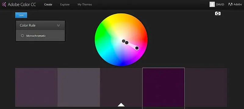
While editing photos use magenta very sparingly at low brightness & saturation levels.
If you are to increase the brightness or saturation do it at select areas throughout the image, but minimally. These areas will usually pull the viewer’s attention immediately.
Final Thoughts on Color Theory
My biggest failures in life have come at times when I thought I knew the answer and stopped looking for new perspectives and ideas.
I’m still learning these skills on a constant basis and update my website to reflect them.
I would suggest spending as much time in nature as possible, hiking through different landscapes & different lighting conditions, without taking images at first.
Study the light and study the color of everything, even when you’re driving or walking down the sidewalk in the city. Try to determine where each color and light intensity would fall on the color wheel and HSL / HSB scale.
You’ll start to notice that our brainwashed perception of color is very different from the actual display of true color in nature. I know this proved true for me.
Only by teaching and constantly learning do I find myself becoming closer and closer to the true nature of things. It’s a never ending journey that I really enjoy.
Thanks for taking the time to read the entire article. Keep learning, keep shooting & have fun out there!
How to 10X Your Learning Speed

The fastest way to master landscape photography is by learning firsthand from someone who has spent over a decade optimizing these skills through trial and error.
Blogs and videos are great for theory, but they cannot replace real-time, field-based instruction.
I offer high-intensity workshops designed for all skill and fitness levels.
In a single 3-day session, I can teach you my entire system—start to finish.
You will receive 1-on-1 feedback in the field that will improve your skills faster than years of self-teaching ever could.
My students often learn more in three days than they have in the previous 20 years on their own.
Stop guessing and start creating portfolio-grade images.